Design system | Desktop software
Context: I’d been invited into a small company that made accountancy software. They had 3 sprint teams, but only 2 people working on the design side. Design work was typically done by analysts and product owners in the sprint teams, which had created a high level of design debt which was matched by a high level of technical debt. One of the ways the business asked me to address this was to create a design system which would standardise and improve the UX of common elements.
Background
The company initially proposed employing a contract web developer to implement the design system as a website. I proposed instead to create it as a site in Axure, which meant that:
the same company-wide visibility could be achieved with much lower development cost, and
further development and maintenance would be far easier and could be done by the existing design team.
Some initial visual work had already been done in Sketch / Zeplin; I began by moving this into Axure and creating an initial information architecture based on previous design system work which structured the design components hierarchically based on how they would be used. This structure developed over time as more components were added. Meanwhile the visual branding of the site was derived from the existing company branding with the support of the design team.
In parallel with working on the design system, I was delivering training on UX to all 3 sprint teams, the aim being to move the company from a view of UX being ‘what it looks like’ to an understanding of UX being about ‘how it works’. To complement this training, some design system pages were created in depth early on so that people could get an flavour of how the design system would be communicated.
Approach
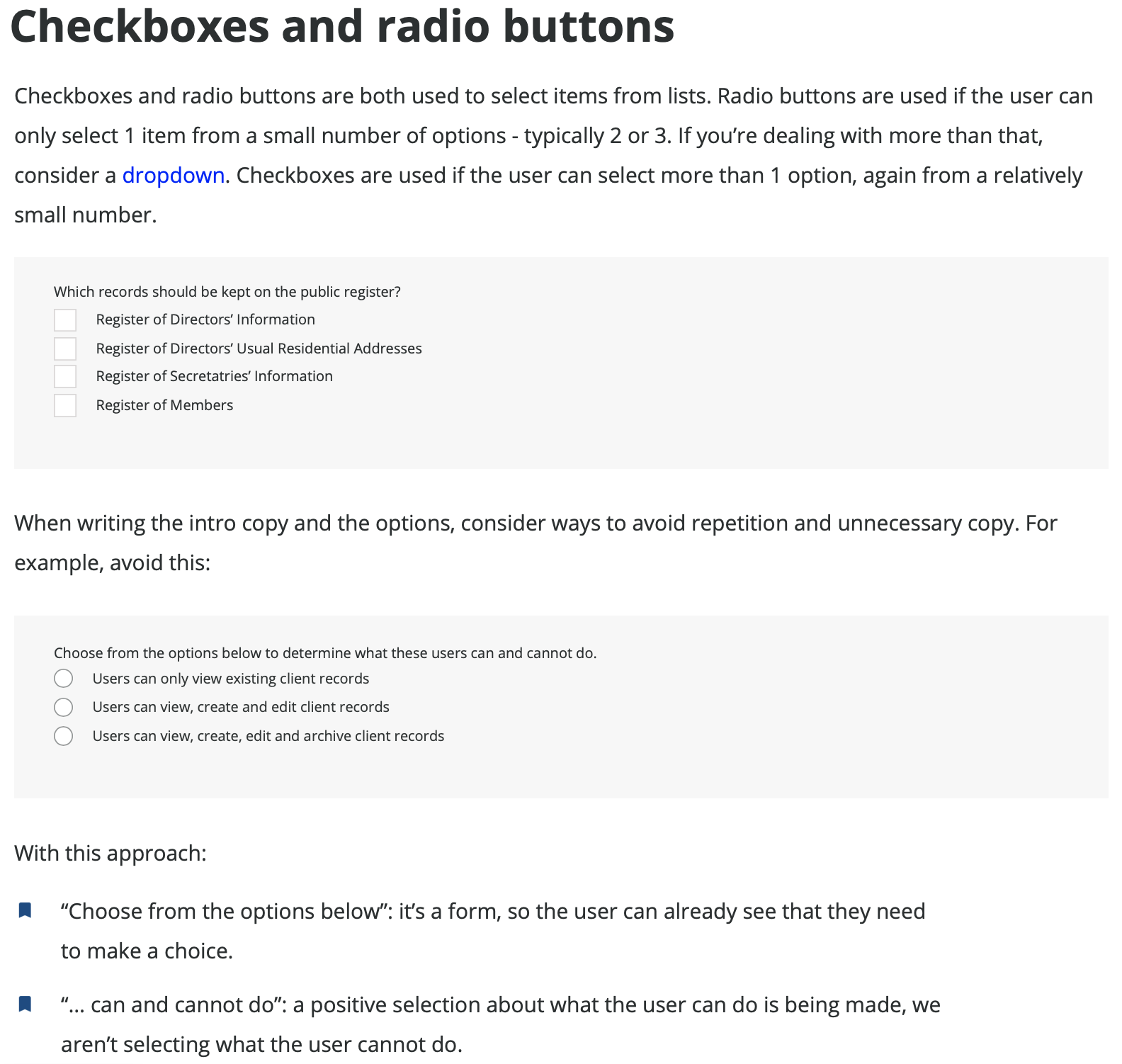
Each component had it’s own page, which set out:
The purpose of the component
When the component was to be used, with links to alternative components
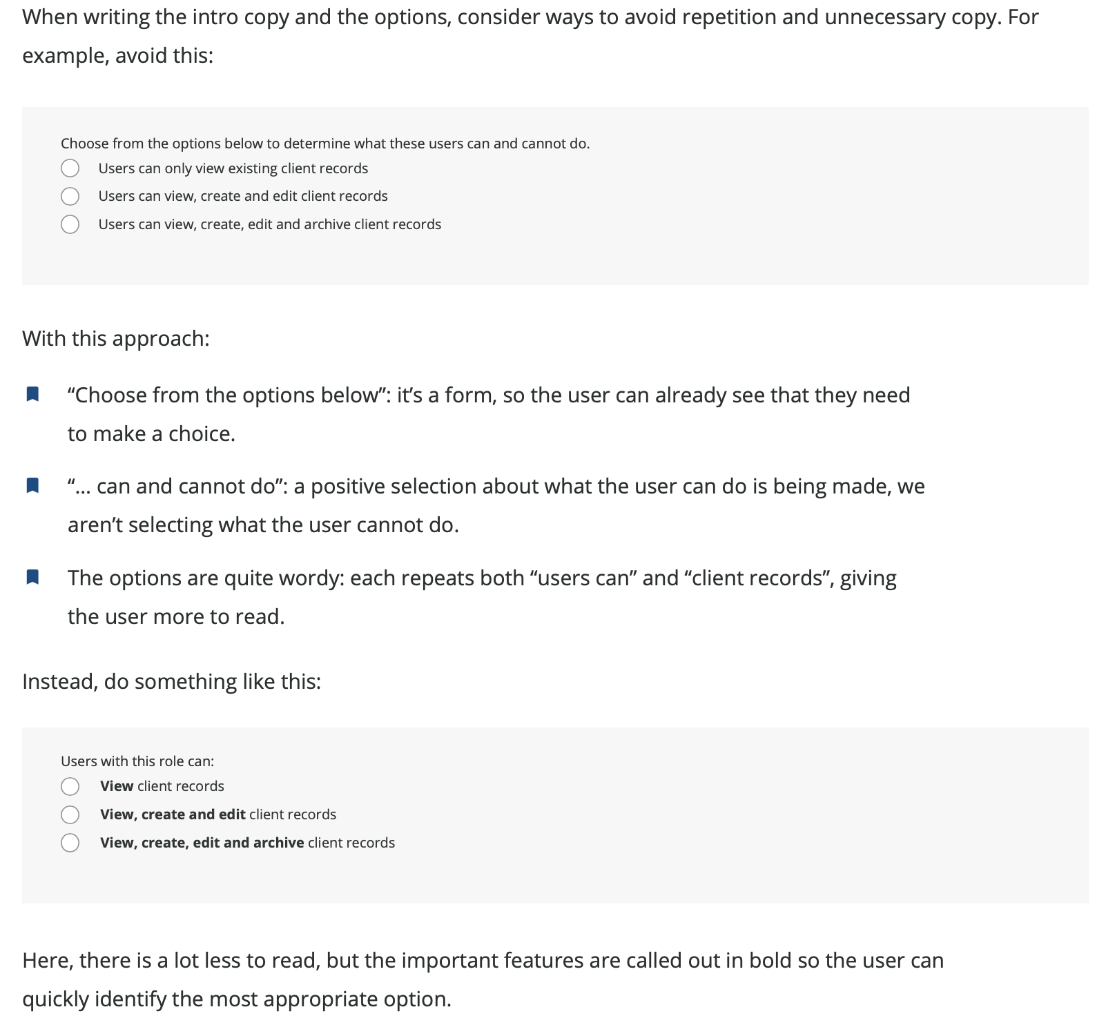
Positive examples of use, particularly around wording
Error handling for common errors
In addition, the design system included many visual examples of the component use that reflected the brand, and showed how the standard was applied in different contexts and in different parts of the system.
Given the desire to develop a deeper understanding of UX within the organisation, rationales were provided throughout so that design system users would be able to make informed decisions including when to challenge. The application relied heavily on tables and forms, so getting these right was essential. With tables, the emphasis was on displaying information in a clean, well-structured way so that the user could quickly find the information they needed.
Challenges and opportunities
Managing stakeholders
One of the key challenges was managing the stakeholders. Some of the people who had worked on the existing design felt that my involvement was criticism of their work; others initially felt that UX was just about how the product looked. To address the former, I had a number of 1-1 discussions with the product owners and business analysts focussing on the new designs and the positive aspects in different contexts. I was supported by an overall business goal to make the product more consistent, which had been communicated clearly. While it wasn’t an immediate turnaround, the people who initially felt criticised ultimately became some of the strongest advocates for the design system.
Error handling
Error handling was a known issue with a wide range of approaches in the existing system, in terms of:
When errors were triggered
How errors were styled
How error messages were written
Addressing this required liaison with the development team to understand what was technically possible, and a review of the existing error handling approaches to define an approach that would be effective in multiple contexts. Ultimately error handling became both an integral part of each component, with common error conditions being identified and error messages provided, and a section on its own which focussed more on styling and more systemic errors.
Addressing design and technical debt
The largest opportunity in the process came with the identification of a strategy to address both technical and design debt. A review of the system had identified that in a number of places, the system presented different user experiences for what was the same basic task. A discussion with the development leads established the picture was identical in the codebase. Accordingly I worked with the development leads to establish a strategy to tackle both the technical and design debt, which would normalise interactions on the system for existing users, make it easier for new users to learn it, and clean up the codebase to make future maintenance and development easier.
Delivery
The goal was for the design system to improve the consistency and quality of designs, helping the company to scale while improving the user experience. As well as delivering the design system as an Axure website, I provided an Axure file that included:
A library of reusable design system components,
Masters for common elements like wizards that could be quickly edited, and
Styles compliant with the design system.
The goal was to make it easy for anyone creating prototypes to conform to the design system, which would in turn support a broader strategic goal to implement user testing with prototypes, initially with key projects, then as part of the standard way of working. In addition to this, the work also supported the understanding of UX within the company together with my conversations with teams and individuals, and the training I delivered to the sprint teams.